ON-FOOT
>> Done in: 2018
>> Client: Pop Sandbox Studio
>> Team: Patio Interactive Inc
>> My Role: Product Design, UX/UI Design
Overview
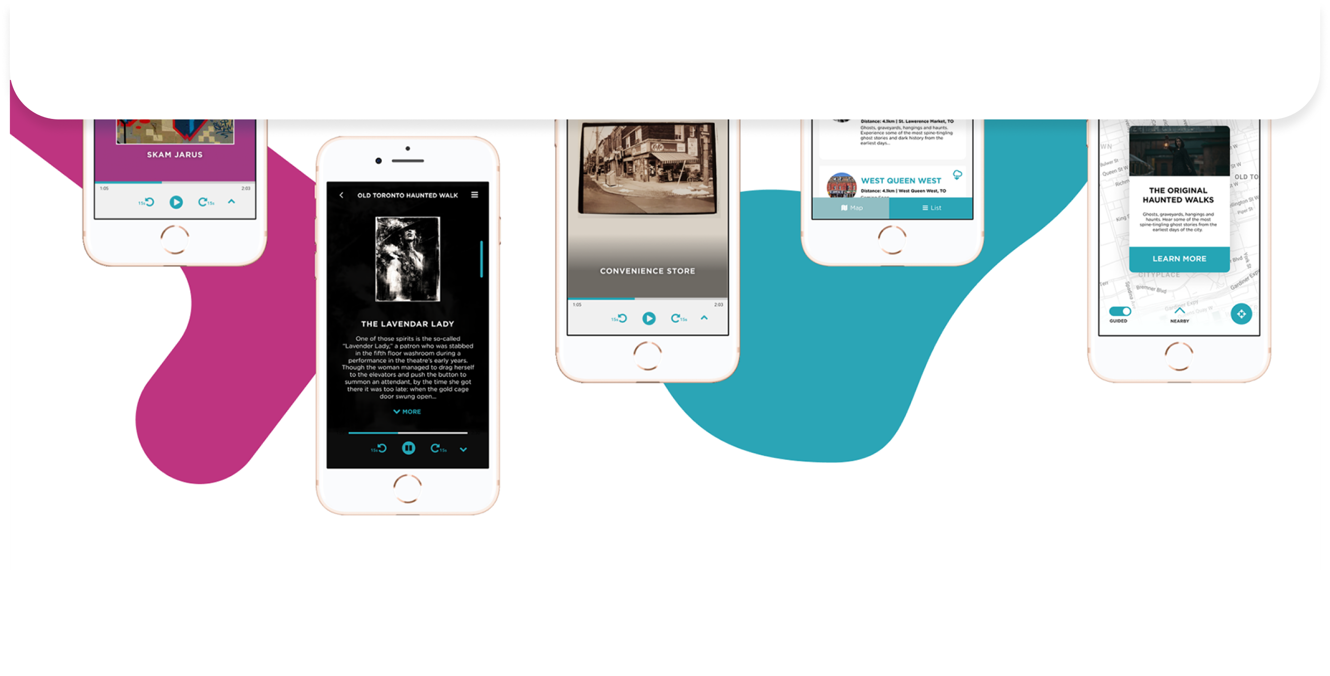
Pop Sandbox is an award-winning multimedia production and publishing company wanted to create a platform that offers fully immersive walking tours with rich interactive media, augmented and virtual reality, and striking audio-visual. As part of the early design process with 2 producers, 2 developers and one PM, I was tasked to help define and shape the product interface and translate the brand into the digital app to set the vision, tone and explore ways to let people discover hidden stories and histories within a city.
Research
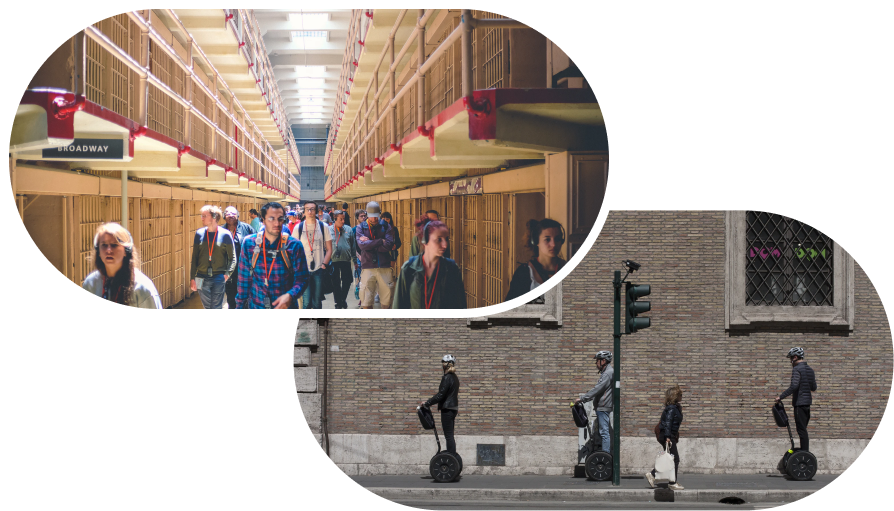
PEDESTRIAN TOURISTS
Walking tours and other social experiences that explore the local area with a guide that usually last a few hours to a day.
From walking tours there were a certain range of people who could engage with the guide at any given time. Outside of that immediate zone, folks from the back of the group couldn’t hear very well. For international tourists there was often a language barrier and heavy budgeting of low data or battery from heavy mobile device usage throughout the day for navigation purposes.
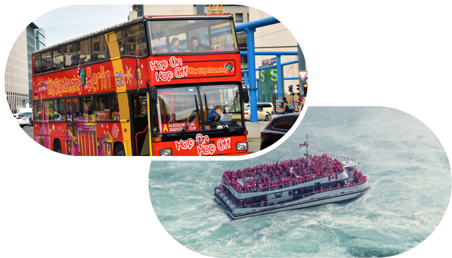
MOBILE TOURISTS
These are comprised of large groups who are on buses, boats and are visiting multiple locations along a journey.
For walking or tour buses alike, there were set times and pace that often was too hurried to enjoy. These were led by tour guides who were also limited to seasonal schedules and varied in quality depending on training etc.
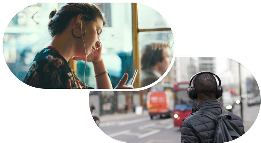
LOCAL EXPLORERS
Longer term visitors or locals who want to explore an area in new ways on their own terms.
This is a selective/niche group of folks who are part of a more curated experience from airbnb or other local tourist groups. They are the ones who are often trying to find quality content and experiences to share and reach out to their personal network of trusted recommendations and hidden finds to curate their vacation experience.
Translating Insights
With these needs and pain points in mind I developed the following guiding design principles, and a core feature set to help align the initial product vision road map.
Open vs. Guided Exploration
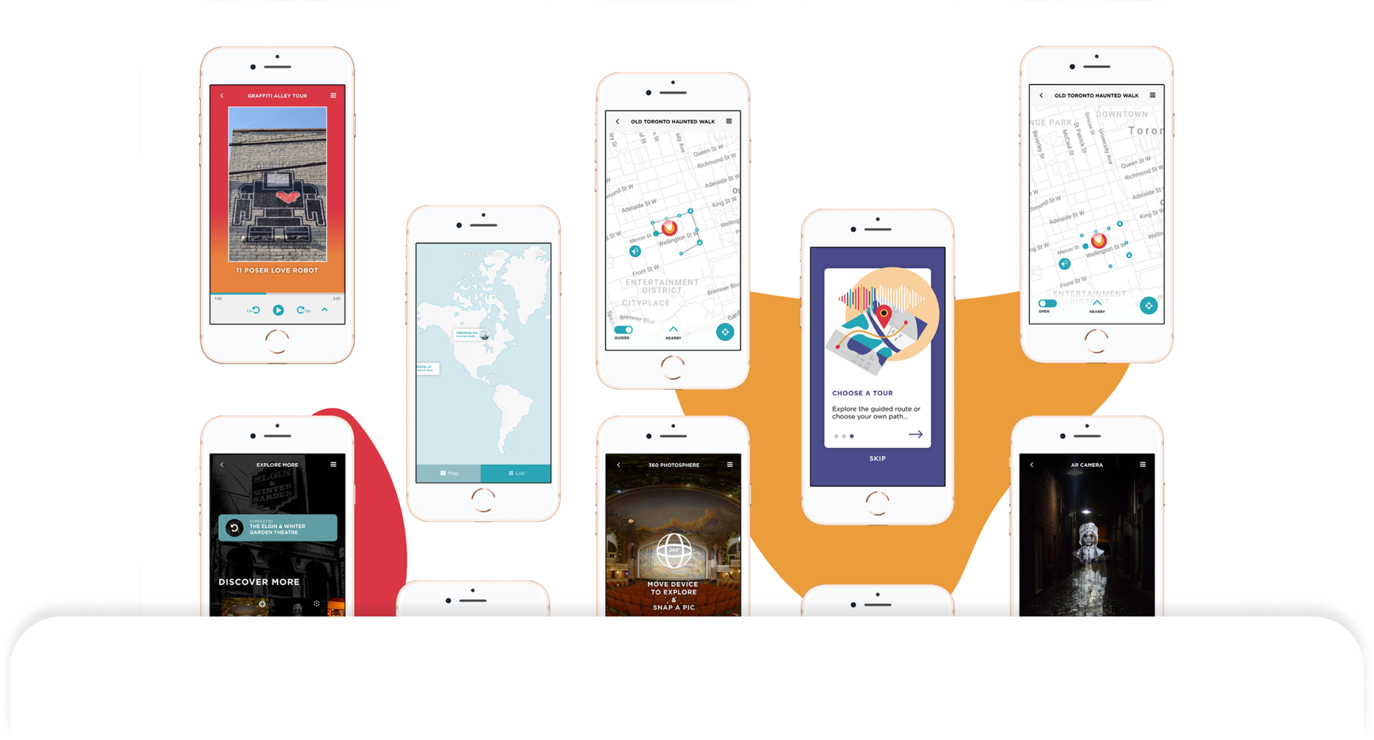
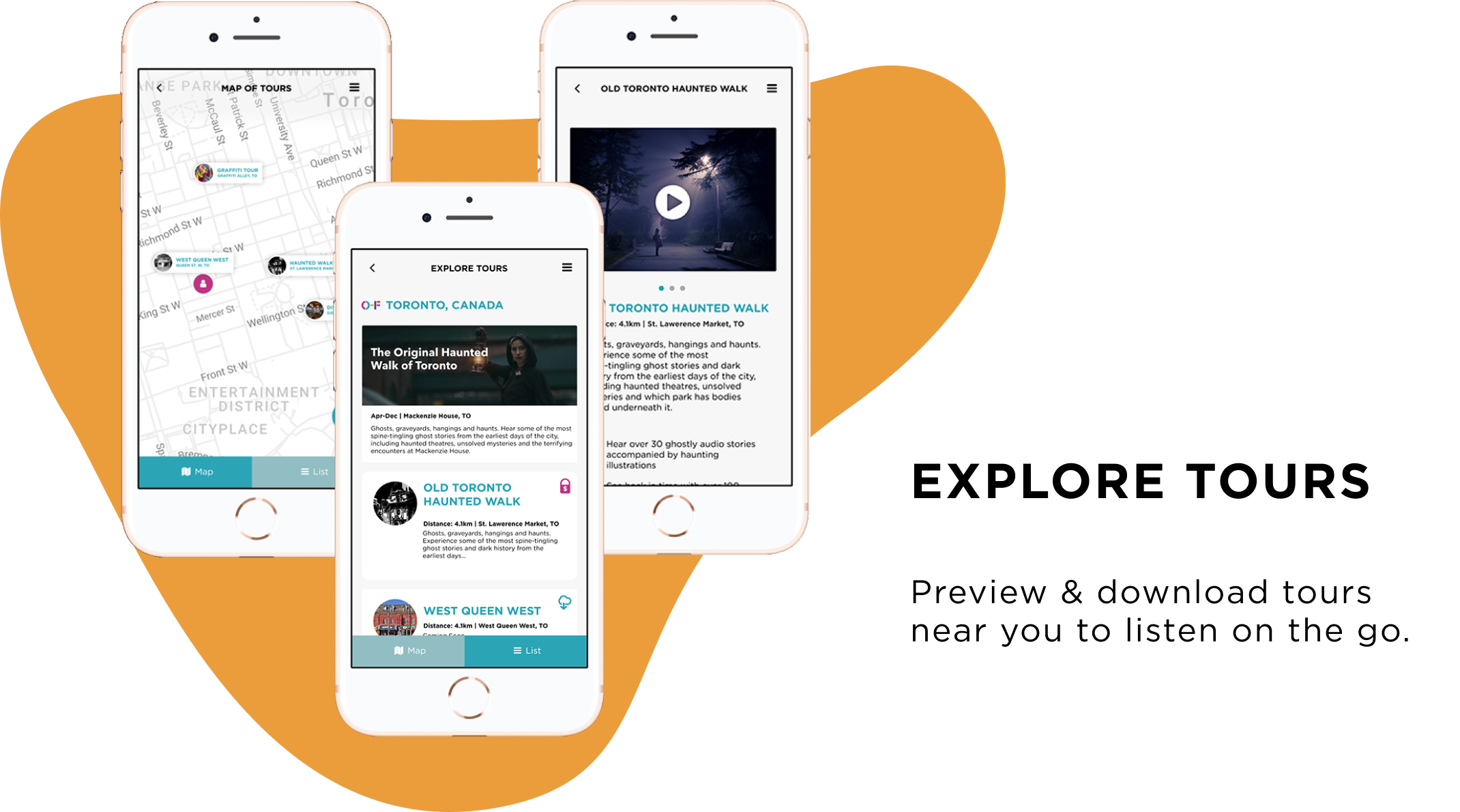
Being mindful of the diversity in our user personas, I looked to apps like airbnb who have both a list and map view that allows the user to agency in their decision process when selecting and engaging with the tour experience. For those who were in a rush to explore an unfamiliar city they could have guided exploration that outlines the most optimal route for each point of interest. For local explorers or those with more leisure time, they can opt for open exploration that let them freely explore any given point of interest in whatever order they please.
Balancing Audio Visuals
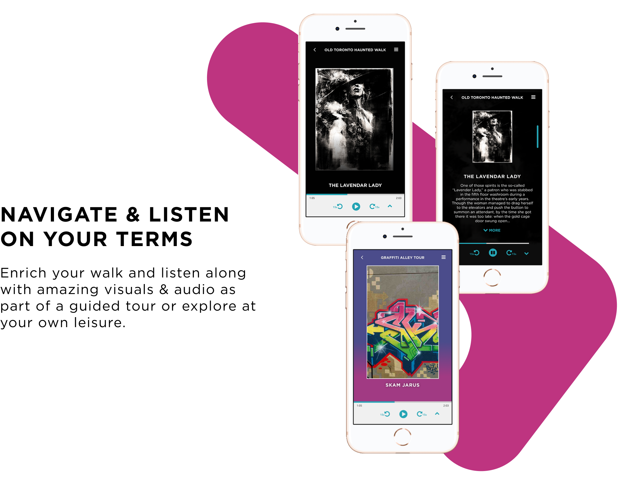
From field studies and observations it was interesting to see the fine balance of when to deliver content and when to let users focus on the momentum/physical environment themselves. We strategically tiered the different types of content with location-based audio as the primary medium to give context while also not impeding visuals. Via the mobile app there were options for text for accessibility purposes and complimentary visuals and illustrations that were intended to be augment the auditory experience at a glance.
Immersive Content
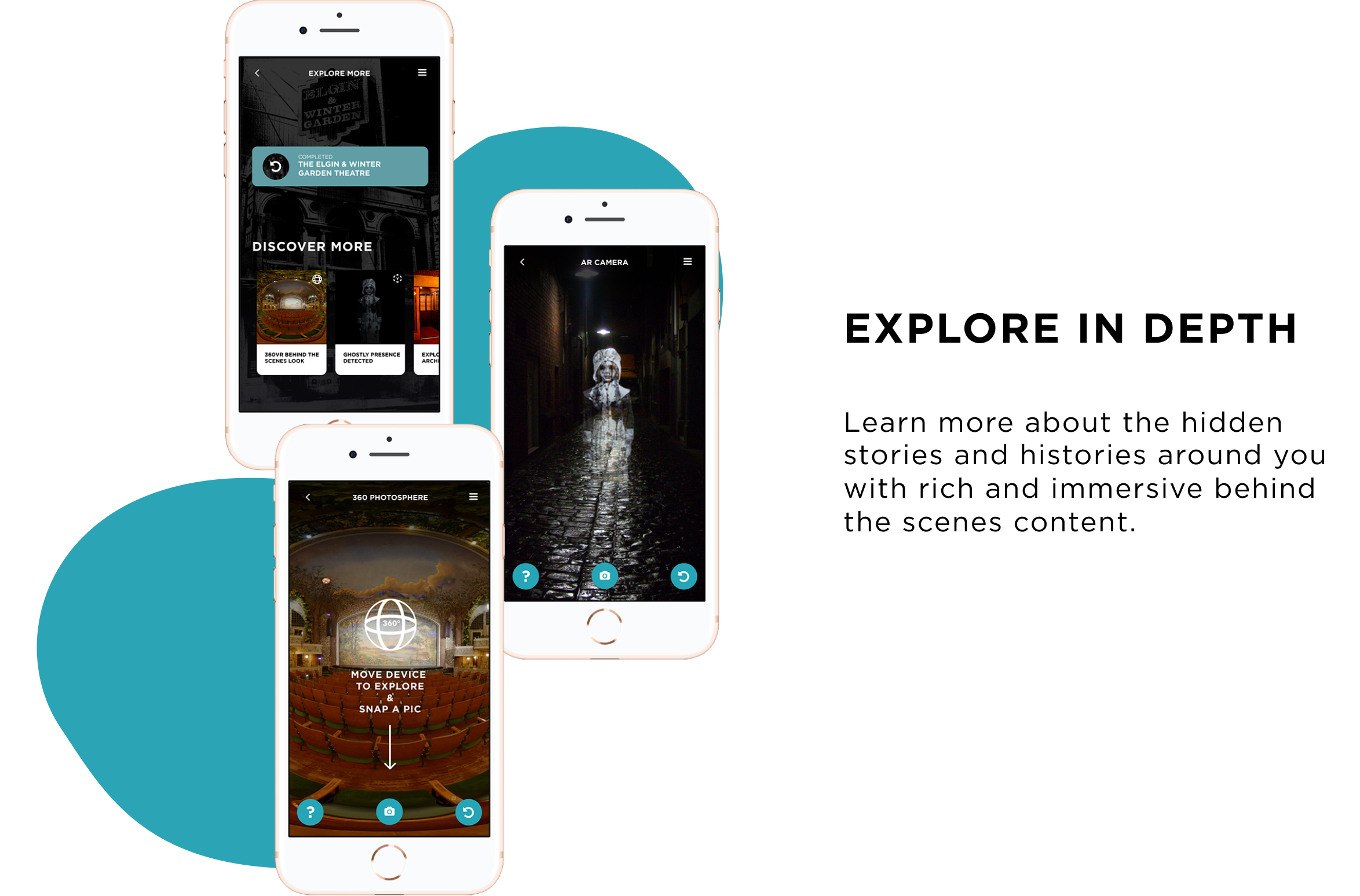
To distinguish from competitors, the emphasis on VR and AR features and content were critical. Often historic sites would not be publicly accessible and therefore 360VR was integrated to showcase an intimate snapshot of what it was like the Elgin Winter Garden theater.
Augmented Reality was also used to highlight specific historic artifacts and landmarks to provide a stark contrast between past and present. For example a 3D visualization of where the gallows used to be as well as ghostly apparitions that haunt Toronto Distillery District that let users visualize and interact with a piece of history!
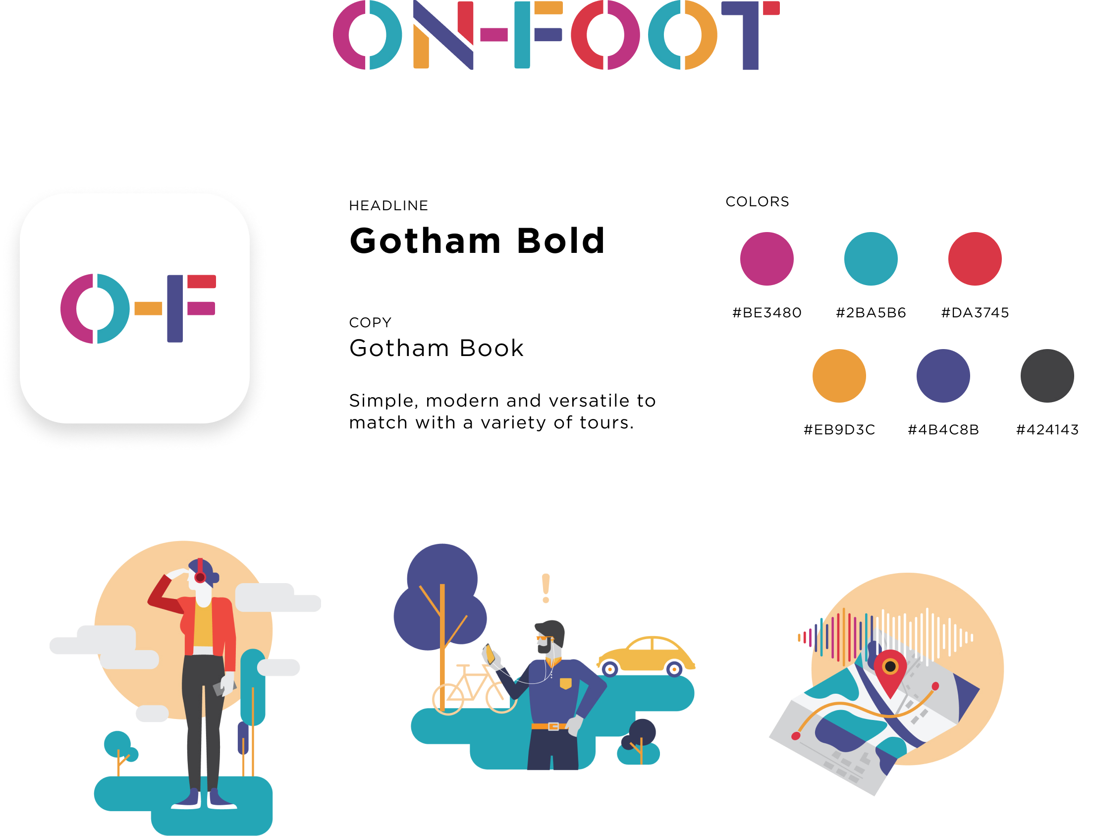
Flexible Branding
Platform needed to be flexible enough to showcase a variety of tours from horror to graffiti alley to historical pioneer village tours. We went with a colorful palette that spoke to the diversity of tours on the platform.
Next Steps
Cognitive overload
Field studies and walks with users showed a wide range of interactions and average tour duration. In a group setting, users often gravitated towards the social AR component which in turn competed with the core audio/visual features of the app. We tried to go with a balanced approach of determining what is the primary content we want to serve first and give a balanced introduction of supporting content based on the context of the user.
Scoping trade offs
As an early consultant for defining and developing the interface for the core features, we realized many of the truly seamless AR experiences will only be possible once AR glasses and 5G are in place. However realizing that does not mean we can’t get started with what we have now. It is always a constant trade off between accessibility, adoption and new technology and how might it evolve beyond just the app into an ecosystem or greater platform for content creation.
What’s next?
Currently On-Foot is in a soft launch available with 5 tours in the Toronto region in 3 languages. As more tours are developed it will be interesting to see what kind of audience will follow and if user behaviours for this new medium will also evolve.
